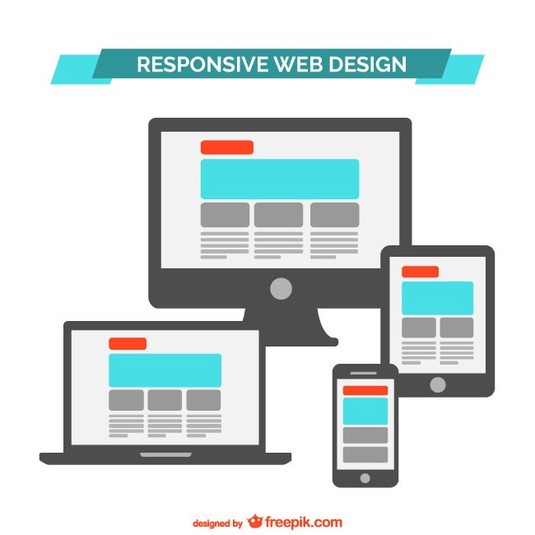
I can’t tell you the last time that I pitched web work to a client without talking about responsive web design and that’s for a good reason - it’s currently the best option for having a cohesive desktop and mobile web presence.
Responsive web design is a way to deliver an optimal viewing experience for your website. It loads your site on most devices in the format that will best display your content. It makes your website load perfectly on everything from a large desktop monitor all the way down to the smartphone in your pocket. Put simply, it makes your content fluid. This YouTube video illustrates this in a quick and simple manner.
Why is Responsive Web Design So Important?
Remember that smart phone in your pocket that I mentioned? More and more people are using phones and tablets to make purchase decisions. They don’t always have the time to visit your site on the desktop computer that’s in their home or office, which is why it’s very important to have your site load in a way that’s usable on mobile devices.
When is the last time you cracked open a phone book when you needed a phone number? It’s probably been a while! There’s no need to when you can find that information through the internet on your mobile device. Study after study has shown that if people can’t easily find what they’re looking for on a website, they just move on. If someone wants to order a pizza and the website isn’t responsive, they have two options - they can struggle to find menu information and a phone number, or give up and move on to a pizza place with a website that’s easy read and use.
Responsive Web Design and Convenience
Responsive web design is all about convenience. With short attention spans and access to anything we want at our fingertips, convenience is very important to today’s consumer. Jeffrey Veen explains, “Day by day, the number of devices, platforms, and browsers that need to work with your site grows. Responsive web design represents a fundamental shift in how we’ll build websites for the decade to come.”
Responsive web design isn’t going anywhere. It’s here to stay and the sooner you implement it into your site, the better!
Joe Hunter is a web and print designer located in Grand Rapids, Michigan. He has worked on business cards, brochures, vehicle wraps, billboards, websites, html emails, logos, branding guidelines, and everything in between. He was born in northern Michigan moved to Grand Rapids in 2004 where he graduated with honors from Kendall College of Art and Design with a BFA in Visual Communications. He loved Grand Rapids so much that he decided to make it his permanent home. He’s been working in the industry for over 6 years now and still finds it interesting every day!


 RSS Feed
